Conversions through UX design — a case study on customer acquisition for the pop-up creative agency “Ideengott”
Marketing managers were messengered with a mysterious artifact that led to a landing page for appointments.

As a UX designer in a team with project management, copywriters, graphic designers and marketing employees from large companies for the acquisition campaign of the pop-up creative agency project “Ideengott”, I was responsible for
- user research and testing,
- prototyping and
- the final visual design.

The Project

The agency wanted to win potential customers for a presentation. For this, the leads were given a large, golden tryptichon by an actor disguised as a “messenger of the gods”, on which there were instructions that led to a landing page. In this way, interested parties should be motivated to make appointments.
Client
The pop-up creative agency project “Ideengott”
Competition
There was a gap in the Viennese agency landscape for such a project, as the large network agencies withdrew from here, while most of the smaller ones focused strongly on the implementation of graphics or video or the like. Medium-sized to larger companies struggled to find unusual solutions for delimited actions.
Objective
Acquisition of a manageable number of well-known medium-sized to large customers with projects that can be implemented for a small creative agency to create a portfolio.
My Contribution
As part of the team, I conceived and designed the campaign in various functions, with the focus on the conversion of potential customers. The customer experience was decisive here, as the campaign itself was to serve as proof of competence for the agency.
My roles
- UX research
- UI/UX design
- interaction design
- prototyping and user testing
Starting point
I started to use paper prototypes to depict every single step of the action in order to visualize the process. In a subsequent workshop, we identified the open questions that had to be clarified with investigations in the target group.
An example of a specific finding by customer research
Through interviews with marketing staff, we learned from the pain of a large insurance company that their lead agency was not to be excited about any unusual pitches as part of a separate calculation in the course of the company’s 100th anniversary. So the department had to come up with something original itself.
I was able to convert this insurance to one of the first clients for the agency.
Bit by bit, little by little
With all the effort involved in getting a “messenger of the gods”, the conversion of interested parties on the landing page was the key point of acquisition. Through research and testing I evaluated the possibilities of
- call-to-action-button
- chatbot
- pop-up
Let’s talk — call-to-action button
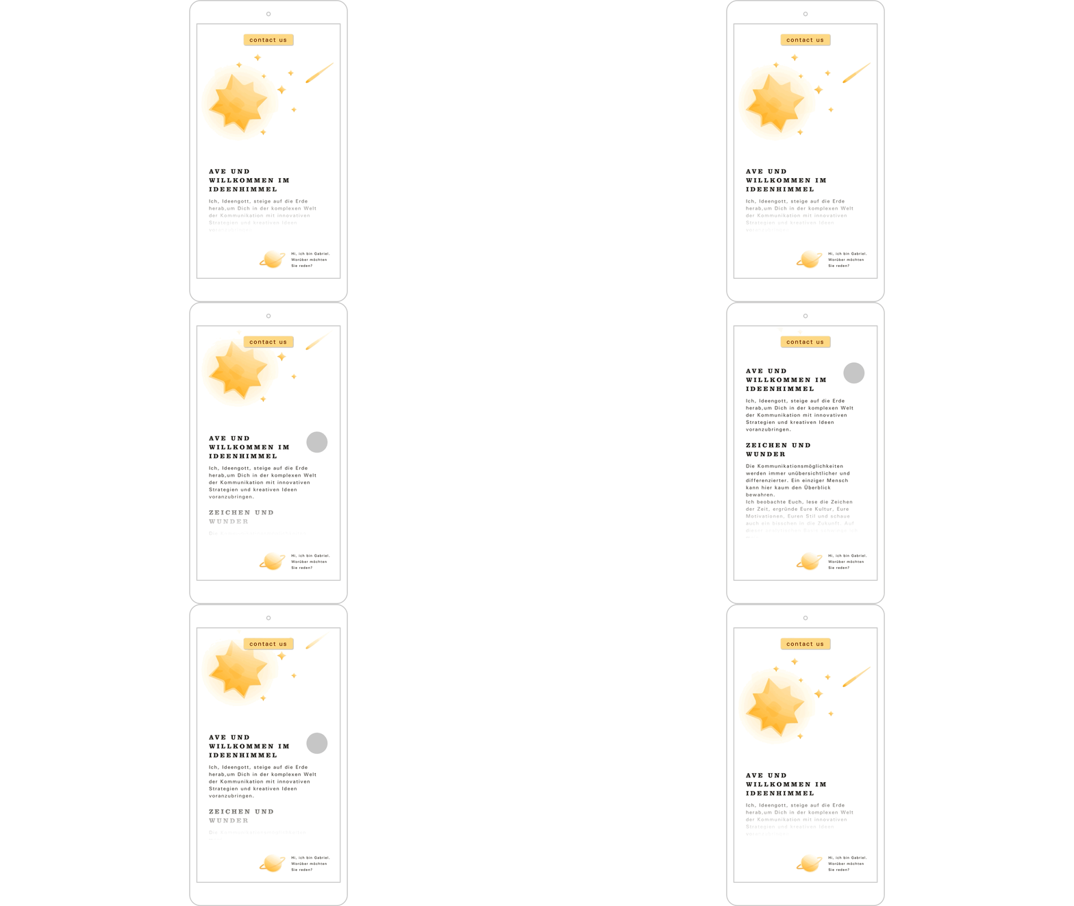
I started with the obvious: a “Contact us” call-to-action button on the first screen — still “above the fold” — and another one at the bottom of the page after the pitch.
During tests at the paper prototype level, concerns arose that call-to-action buttons might be too down-to-earth for such an elaborate action. I followed up this question with mock-ups and it turned out that the buttons were well received by the users.
I even found out in A / B tests that the conversion of the first button increased by 13% if I positioned it in the middle of the top of the page.

The leads addressed were often so excited by the unusual action that they could easily overlook the specific economic intent behind it. With the call-to-action button first on the landing page, everyone knew what it was about right away.
Hi, my name is Gabriel. What do you want to talk about? — chatbot
My starting hypothesis was that a chatbot would perform best in this logic of direct and dialogue marketing, in which the customer approach was moving. In terms of integration, the usual design should fit in well with the overall picture using a floating icon at the bottom right of the page.

During the costumer research it turned out that the very different contact persons have many very different questions about a broad topic like the offer of a creative agency to the chatbot. In order to be able to use the full potential of a chatbot in the direction of conversion, a lot of optimization work had to be done.
As soon as the tonality in the customer approach deviated too much, the conversion with chatbot was lower than with just a call-to-action button. So, for the time being, I downgraded the bot to being an assistant for questions it could answer. I also left it open what we would do if he had any questions about which he didn’t know what to do. Should he apologize, forward the chat to an employee, or refer to an appointment?
An optimally set AI would probably have been the best solution in general, but in the context of the given project, in the given time frame, an optimal performance could unfortunately not be guaranteed.
So we decided that if the chatbot didn’t know what to do next, it should again –like the call-to-action button– suggest a personal appointment.
Seriously now, we should really talk! — pop-up
Pop-ups were the last resort for me to openly and directly address customers to make an appointment shortly before they left the landing page.
Designing the contact form was a challenge. Interested parties should let us know
- that they wanted to be contacted by us to make an appointment,
- via which channel (e-mail, phone, messenger, etc.) they wanted to be contacted by us.
After testing the different designs, there was a winner and a loser:
- The variant with a free text field, in which the customers could also make appointment suggestions themselves, performed worst. This option was too vague.
- The shortest pop-up performed best, in which only the name and the preferred contact option had to be entered, with a “I want an appointment” button to send.

All three
Almost by chance, in an interview to evaluate a subordinate variant, I tested all three means, i.e. call-to-action button, chatbot and pop-up, at the same time. Surprisingly to me, this option received the most positive feedback during the test, so I continued to pursue this approach.
For further research, I coordinated all three means with one another and was able to deliver 30% better results compared to the other variants. I understood the feedback from the costumers to mean that the (actually much too intrusive) request to make an appointment was perceived by all three means in the given context as creating trust. This made it clear to the companies that we, like them, were about customer acquisition and that we would get our hands dirty for it.

Process-oriented design development
The great challenge in the design development was to combine the very pictorial and ironically inflated name with high quality and exclusivity. Precisely because there were so many quick ideas for the depiction of gods in the course of human history, any direct illustration of sublime beings under the title “Ideengott (God of Ideas)” was classified as low-priced.
Thou shalt not make thee any graven image
After I presented the first mockups it became clear that the design had to go in the direction of minimalist, indirect symbolization.
I found that
- stars were well understood,

- rich gold was emotionally linked to quality and religion,

- the combination of the Clarendon and Univers fonts conveyed the offer in the most understandable way.


Scroll me baby
I was able to make the magical aspect of the supernatural tangible through a reveal effect when scrolling. The lower third of the page emerges slowly when you scroll down and appears on the screen as if by magic. The simple effect was particularly effective on mobile devices.

(Please reload the page if gif is not displayed.)
Just a little bit of code
I was able to solve this very simple scroll animation myself without a request to a database or similar using the skrollr.js library:
<script type="text/javascript" src="js/skrollr.stylesheet.min.js"></script><style>
.example {
skrollr animation name:animation1;
}
@-skrollr-keyframes animation1 {
0 {
opacity: 0;
}
300 {
opacity: 1;
}
}
</style>
The challenge consisted rather in the differences between the different browsers, as well as in depositing suitable fall-backs for protection.
Test, test, test
Since I had to reach a very demanding target group with marketing managers, I applied exactly the same customer experience standards to the physical action of delivering the artifact as for digital products.
The messenger of the gods
Through our research in the marketing department, we found that the most busy department heads are most likely to be persuaded to receive a message in person with a loud appearance.
So a messenger of the gods, conspicuously decorated with toga and laurel wreath, appeared at the reception. The enthusiastic marketing management received a large tryptich that revealed a “magic word”. If you googled this word, you only got a single search result that led to a landing page. Since every potential customer received an individual magic word, we were able to address this personally on the landing page, which promised an additional effect.

Optimization through testing
During trial runs, we discovered that outdated versions of Internet Explorer were still standard in many companies. I had optimized our online handshake only for the common browsers, but not for these generally uncommon Explorer versions. Thanks to these tests, I was able to secure our performance.
Talking is gold
After the entire team had made every effort to offer our contacts the greatest possible show, we evaluated the first errands with subsequent surveys.
In their feedback, our potential customers made me understand that the campaign was too much about us and not enough about them. The dazzling appearance undermined the trust of the contact persons that the creatives could adapt to the volume of the company when they were commissioned. So the agency had to step down a bit.
Learning
The other actions were carried out by a normal messenger service. I also adapted the artifact to be handed over from a hand-made tryptichon to a pyramid produced in series in the print shop. This compact form was in a comparable range in terms of design, but could be produced very well as a product packaging.

There was a 15% drop in personal receipt of the artifact. The pyramid was nevertheless noticeable enough that it was sent to all contact persons. I was able to increase the result with the improved action in two ways:
- Customers saw that we could make a big impact with little money.
- We saved money and thereby increased our return.
Business Case
The acquisition campaign was carried out 27 times and there were 24 responses. By calling the three non-conversions afterwards, we learned that these companies were only interested in commissioning design implementation and already had permanent partners for this.
From the 27 presentations we achieved, we were able to implement projects for well-known customers such as
- conception and prototyping for the online collection of the Wien Museum,
- a new online music magazine for Universal Music,
- sales management SEE from BMW: video-documentation of sales talks in car dealerships from Poland to Hungary (with hidden cameras in glasses and pens).
These projects were included in the portfolios of those involved, who subsequently achieved professional development
- in the publishing industry,
- as an art director or
- as a PR manager in a leading large company.
