Project “Premium Living” by findmyhome.at – a UX Case Study
As Senior UX Designer for the real estate portal findmyhome.at when creating the new enterprise software “Premium Living”, I was responsible for user research, wireframing, visual design and prototyping, up to the HTML/CSS-Handout. My project team consisted of marketing, quality management, developers and — selectively — the management.
With this product, the company was able to successfully open a new line of business.

The Project
My Client
Real estate portal findmyhome.at

The new product “Premium Living” is a comprehensive content management system for the creation of websites for the attractive presentation of exclusive properties, which was rolled out to property developers, real estate offices and brokers.
Different data from low-tech-savvy employees of real estate agencies should be able to be entered and these clients should be able to be administered and billed by us.
We had a fixed deadline with half a year time for the market launch.
Existing products on the market
The existing systems are not very intuitive, so that
- customers and employees have to be extensively trained and
- the processing time is long and personnel-intensive.
Goal
The new product should enable a higher margin business model by allowing property developers, real estate agencies and brokers— from low-tech savvy realtors to millenials — to intuitively create and edit the information and media themselves.
My contribution
I was responsible for the conception and design of the app in various functions, in constant communication with the developers, up to the hand-off of a functional HTML / CSS file.
My roles
- User Researcher
- UX Designer
- Interaction Designer and Prototyping
- User Testing
- Visual Design
First approach
- We started with a workshop in three parts, as our decider, the CEO, was only available to a limited extent. Front-end and back-end development were present at every appointment.
- Then I conducted interviews with power users of previous systems, such as sales managers or data entry specialists in real estate offices. I always resorted to the expertise of these users, right down to the user tests of the prototypes.
An example for the development of new features by user research
Through this user research, I came across the problem that sales employees in particular have different contact persons for an object, such as property developers, real estate agencies or brokers for individual properties. In the previous systems, it was only possible to specify a single contact person per object.
The input option for contact persons at each client level became a key feature of the new product.
The toils of the plain
I put a lot of emphasis on working with wireframes and on meetings with the various stakeholders to set up all business and legal requirements with the best possible user experience.
Menu navigation
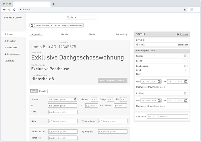
A central point of the app are the screens for creating client and object data. Over several iterations it was possible to structure the different categories of information:
- Client data
- General information about the object
- Detailed information
- Media uploads
- Display of objects on the landing page
Evolution of the Home Screen
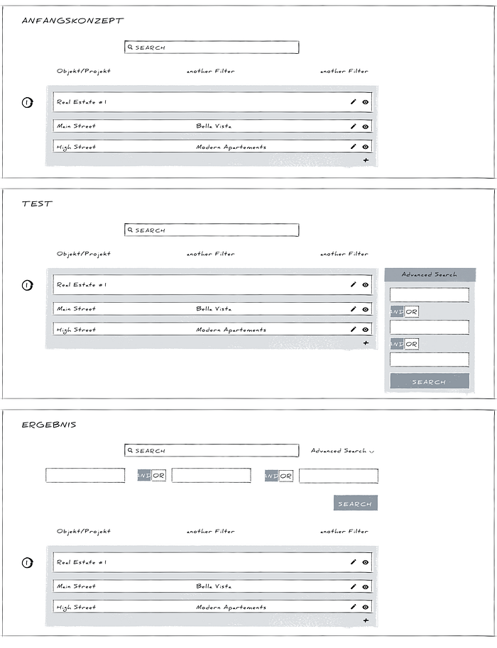
In the initial concept, the list view of the home screen was only for the overview and the search for clients or objects/projects. The main focus of the original list view was on the filters and the fast search.
Through several iterations of lo-fi prototypes, I was able to display all essential information in this list view and make it editable.
The list view became more and more from a pure search to the primary tool for data entry.
This also changed the weighting between clients (germ. “Kunde”) and objects (germ. “Objekte/Projekte”): In the beginning we assumed that the client is central and that the objects/projects are assigned to it. With the new possibilities, the desire arose to be able to create and edit objects/projects independently of clients.

Discarded designs
One of the numerous examples of the evolution of the design is the search function: Originally, only a general search field was planned as a top bar. Then we tested an advanced search in the sidebar especially for the list view. Due to the growing importance of the list view, we noticed during interviews that users were confused about the two positions of the different searches. So we reunited the search function by moving the advanced search up to the general search field.
The Finish
The company’s branding was very much focused on classic print design, with little experience in the transition to digital design.
The color palette consisted mainly of a dark blue, which was also used for headlines, resulting in difficulties in the consistent display of hyperlinks. The second main color was a rich red, with a great similarity to error messages. To ensure a comprehensible and consistent design of the app, I used alternative color scales which allowed me to preserve the color values of the CI colors and adjust only saturation and brightness.
Very early on, between the lo-fi wireframes, I gradually scattered individual screens in the direction of the final visual design, to test the reactions. In the course of the further loops I tried more and more screens in more and more elaborated visual design, so that I was able to achieve an understanding of inclusion, readability and consistency among the team members.

Interactions
Since there are many interdependent options in the app, it was useful already in the very early stages of wireframing, to design prototypes in order to test the individual screens, or parts of them.
Click-through homescreen — client — object:
The following click-through shows the main interaction possibilities in the list view. For easy overview and search, the entries are listed in single lines, but can also be expanded by clicking on the bar. Thus the essential business relevant information about the client can be created or edited (including booking period).
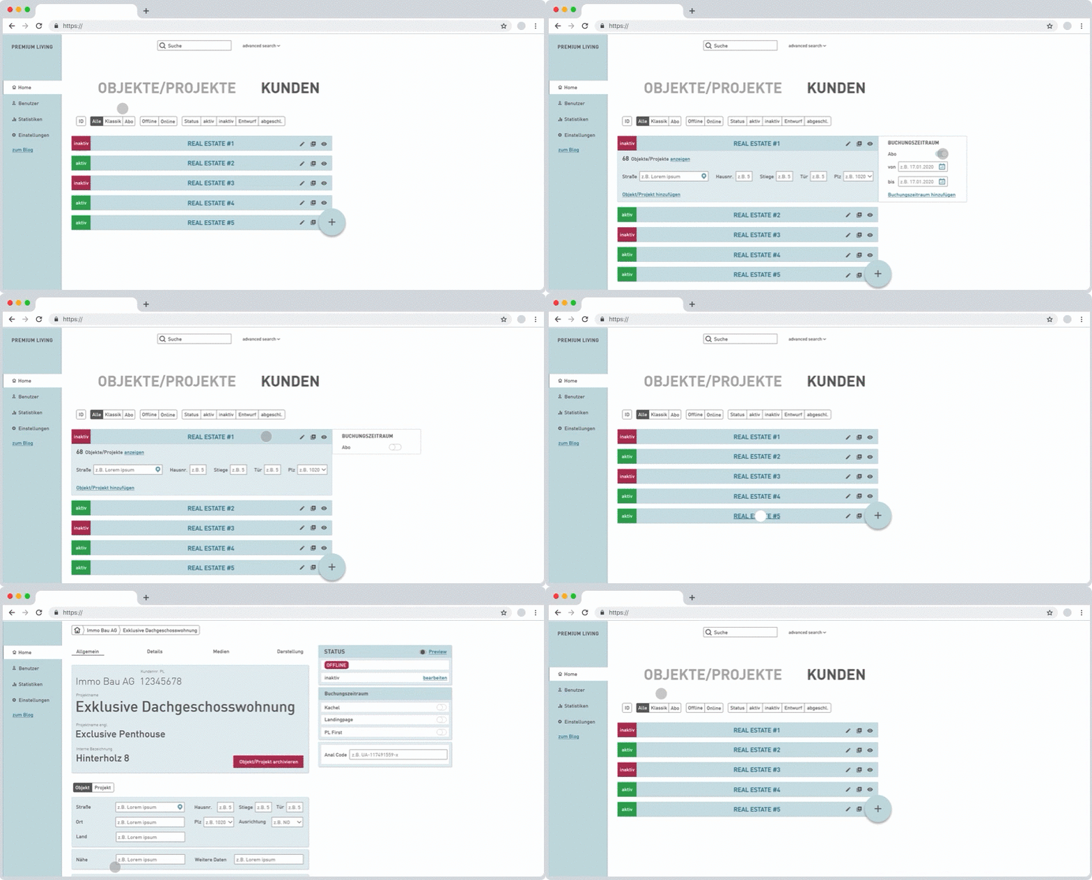
When hovering over the customer name, the hyperlink to the data record appears. Via this micro-interaction, the user gets to the full data set of the client, with the corresponding objects below. Like this, objects belonging directly to the client can be easily created or edited.
Vice versa there are the same options in the objects/projects list view, where you can also click through from the object to the client, or create a new entry.
Especially the possibilities of quick editing in the list view became apparent only through prototypes, so we have continued to expand this asset.
Name change of an object:
The subsequent micro-interaction of editing/creating an entry in the list view made the above-mentioned higher-level structures possible for us.
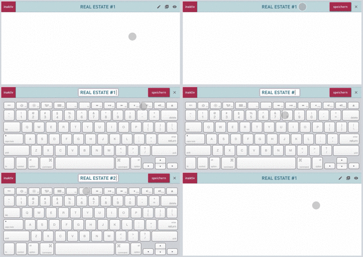
Instead of clicking on the bar, the edit icon is selected here. Having to take that step creates additional security and trust, as nothing can be changed unintentionally.
The icons are replaced by the save button, which visualizes the edit mode. When you select a field for editing, a colored border indicates that only this field can be edited. Now a new entry can be created or an existing one changed.
Through the three icons on the right, an entry can be duplicated, edited and saved quickly, and then checked as a preview on the landing page.
The Micro Interaction Possibilities are
- Toggle bar
- Hover and click on the name
- Duplicate
- Edit
- Preview
- Save
Surprise
During the first presentation of all screens in the final design, there was a sudden stop of feedback. After some inquiries about this reluctance, it became clear that the presentation of the “finished” design caused everyone to respectfully hold back.
However, once I was able to allay these fears, the advanced visual design and the high-fidelity prototypes proved to be very conducive to discussion. The following feedback was great and brought us all a significant step forward.
Learning
The more a product resembles a functioning app through visual design and prototyping, the more users become aware of what they actually want.
The difficulty lies in presenting something that looks “finished”, but at the same time gives team members and test users the feeling that they can express change requests. You have to be prepared for the fact that this may result in significant developments and benefits for the product at a rather late stage of the design process.
Hand-off
From the first workshop and at every meeting, development was involved. Throughout the whole project I was in constant communication with frontend and backend development about the technical feasibility of the screens and prototypes.
We exchanged design assets through tools like Invision and Zeplin, but the actual handoff was a functional HTML file I wrote in Visual Studio Code.
In this HTML file I traced all fields, switches and interactions back to their underlying HTML functions — checkboxes, radio buttons, input fields, etc. — so that all inputs, database logic and functionality could be tested during the first loop of technical implementation.
At each step I noted in detail what needs to be done and what needs to be considered, with the corresponding designs and prototypes as templates.
Our developers fully accepted the handoff and were able to go directly into the implementation, using react.js.

Nico, our php-
Win/Win
As a representative of the user in the creation of this digital product, I was able to design a backend that can be used intuitively without a manual or lengthy training.
- Acclimatisation time < 10min.
- Expenditure for data record creation –60%.
- No technical support necessary
User Research and Testing have added value to the product. The interactions and visual design meet international standards and clearly set the app apart from the competition.
